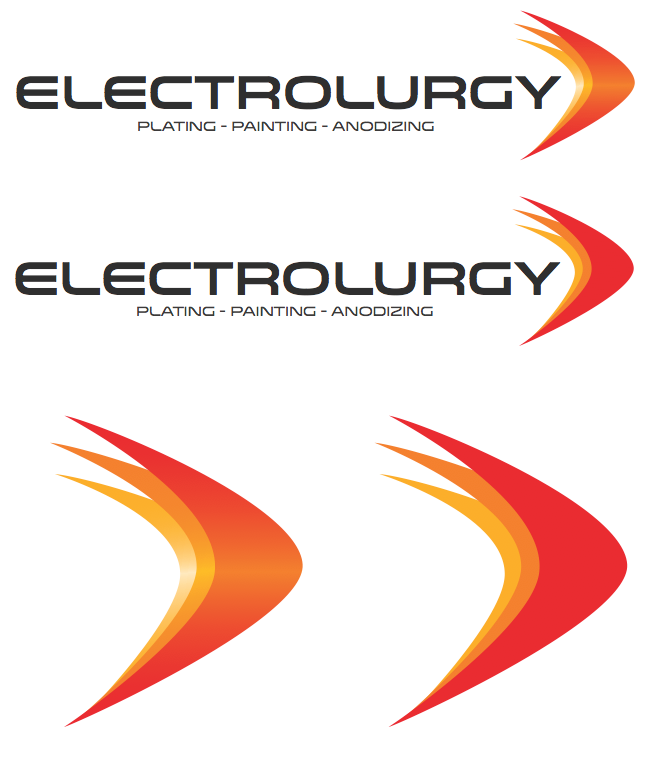
Electrolurgy is a family-owned metal plating and anodizing business. After being in business for more than 60 years, they decided it was time for a new look, and I was hired to create their new logo and brand identity.
The curves of the logo are based on the nose-cone of a Boeing jet that Electrolurgy prepares many of the parts for. Since most of their clients are in the aerospace field, we went with a clean and modern military-inspired feel, using sans-serif fonts and very subtle brushed metal textures. Several versions were created with varying degrees of depth for different applications.

